Overview Dashboard
Your workspace home page — KPIs, query volume, field intelligence metrics, documentation gaps, and system health.
What this page does
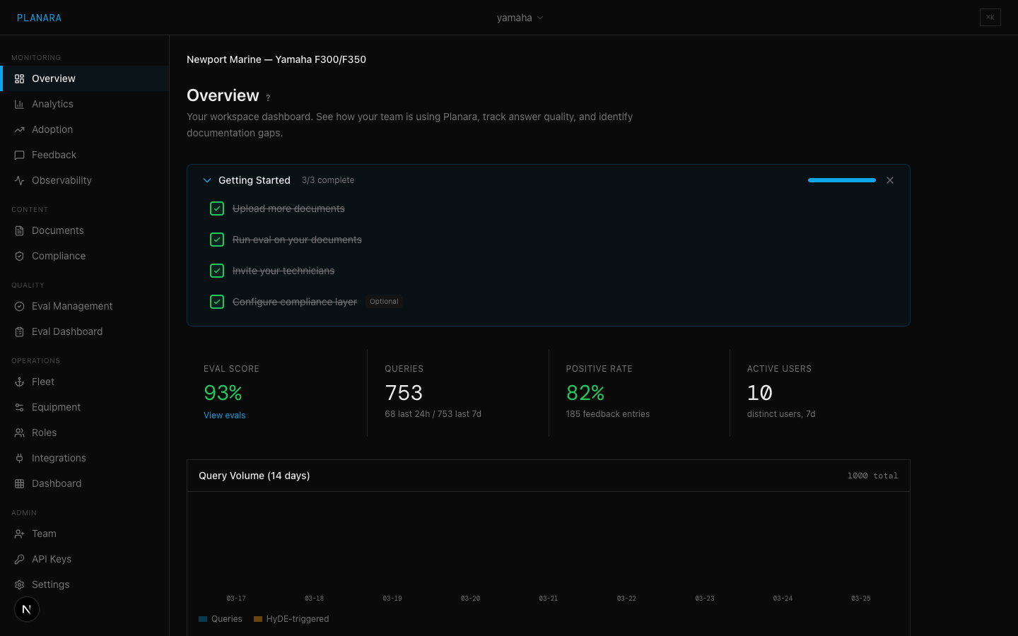
The Overview Dashboard is the first thing you see after login. For a dealer admin, it shows how your team is using Planara and where your documentation has gaps. For an OEM network admin, it shows adoption and intelligence metrics across the dealer network — which dealers are active, where documentation gaps are systemic, and what field intelligence is accumulating.
Sections
KPI Cards (Row 1)
Four summary metrics displayed across the top:
| Metric | Description |
|---|---|
| Eval Score | The pass rate from your latest eval run. Displayed as a dash (--) until you run your first eval. Links to the Eval Management page. |
| Queries | Total query count for the last 24 hours and last 7 days. This counts all queries processed through your namespace, regardless of role or user. |
| Positive Rate | Percentage of feedback entries that are thumbs-up. Color-coded: green (80%+), yellow (60-79%), red (below 60%). Shows a dash if no feedback has been recorded. |
| Active Users | Count of distinct users who have queried Planara in the last 7 days. |
Query Volume Chart (Row 2)
A 14-day bar chart showing daily query volume. Each bar represents one day. The chart also breaks out recovery queries -- these are queries where Planara triggered an answer recovery pass to improve retrieval for vague questions.
What to look for: Consistent or growing volume indicates adoption. Sudden drops may indicate an outage or access issue. High recovery rates on specific days may correlate with vague or unusual query patterns.
Recent Feedback (Row 3, left)
The 10 most recent feedback entries (thumbs up or down) with the query text and timestamp. Each entry shows:
- Sentiment indicator --
+(green, positive) or-(red, negative) - Query text -- what the technician asked
- Time -- relative timestamp (e.g., "3h ago")
A "View all" link navigates to the full Feedback page.
Documentation Gaps (Row 3, right)
Aggregated negative feedback, grouped by query text. When multiple users ask the same question and rate the answer negatively, it appears here with a count multiplier (e.g., 3x). This is your strongest signal for content gaps.
What to look for: Repeated queries with high counts indicate topics where your documentation is missing or insufficient. These should be prioritized for new document uploads or content refinement.
Content Performance (Row 4)
Shows query distribution by topic area (skill) over the last 7 days. Each skill maps to a content domain:
| Skill | Content Area |
|---|---|
| general | General knowledge, no specific skill match |
| winterization | Winterization procedures |
| pre_season | Pre-season preparation |
| maintenance | Regular maintenance tasks |
| troubleshooting | Diagnostic and troubleshooting |
| safety | Safety warnings and procedures |
| specs | Technical specifications |
| parts | Parts catalog lookups |
| electrical | Electrical systems |
| propulsion | Propulsion systems |
Bar width is relative to the most-queried topic. Use this to understand what your team is asking about most.
System Health (Row 5)
Three operational metrics for the last 24 hours:
| Metric | Description |
|---|---|
| Avg Latency | Average end-to-end response time in seconds. Under 20s is good. Over 30s may indicate performance issues. |
| Cache Hit Rate | Percentage of queries served from cache. Higher is better for repeated questions. |
| Recovery Rate | Percentage of queries where semantic recovery was triggered. Recovery improves retrieval for vague queries but adds latency. |
Field Intelligence Summary (Row 6)
For tenants with the field intelligence loop active, this section appears:
| Metric | Description |
|---|---|
| Active Corrections | Count of field-validated corrections currently influencing responses. Links to the Corrections page. |
| Pending Corrections | Corrections submitted by technicians waiting on validation. A high count means the field is talking — someone needs to be listening. |
| Resolution Rate | Percentage of repairs resolved on first attempt this week. Trending up means the knowledge base is actually improving. |
| Knowledge Velocity | New corrections and diagnostic improvements entering the system per week. Higher velocity in the first 90 days is expected — the system is learning fast from a standing start. |
Network View (OEM admins)
OEM administrators with cross-namespace access see an additional network summary:
- Dealer adoption grid — all dealers in the network with adoption status (active / low usage / inactive), query volume, and satisfaction rate
- Network-wide documentation gaps — the same gap analysis as the single-dealer view, aggregated across all dealers. A gap showing up at 5+ dealers isn't a dealer problem — it's a documentation problem.
- Field issue alerts — query spikes about the same symptom across multiple dealers, flagged for investigation
- Correction clusters — corrections submitted independently by multiple dealers for the same procedure, which usually means the documentation needs updating
Common actions from this page
- Click "Run eval" on the Eval Score card to navigate to Eval Management
- Click "View all" on Recent Feedback to go to the Feedback page
- Use Documentation Gaps to identify which topics need new content uploads
- Review pending corrections to validate and activate field knowledge
- For OEM admins: drill into dealer-level metrics by clicking a dealer in the network grid